A Modern Rebrand for Compassion House
Compassion Ministries provides residential care for pregnant and parenting young mothers ages 11–21 who need a safe, structured environment where they can grow, learn, and build a stable future. After more than 30 years of service, the organization was ready for a visual identity that better reflected both its legacy and its continued impact.
The Challenge
The existing logo and brand presence had become dated and no longer resonated with modern audiences. While the organization had a powerful mission and long-standing community credibility, the visual identity was not effectively communicating that value to new supporters and potential donors.
The goal was to create a refreshed brand that felt contemporary and approachable while still honoring the organization’s history and the trust it had built over three decades.
The Approach
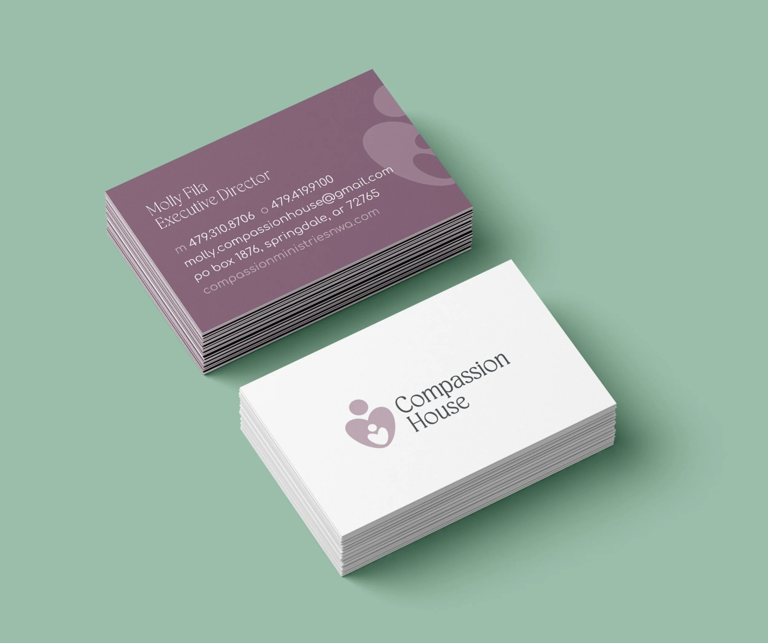
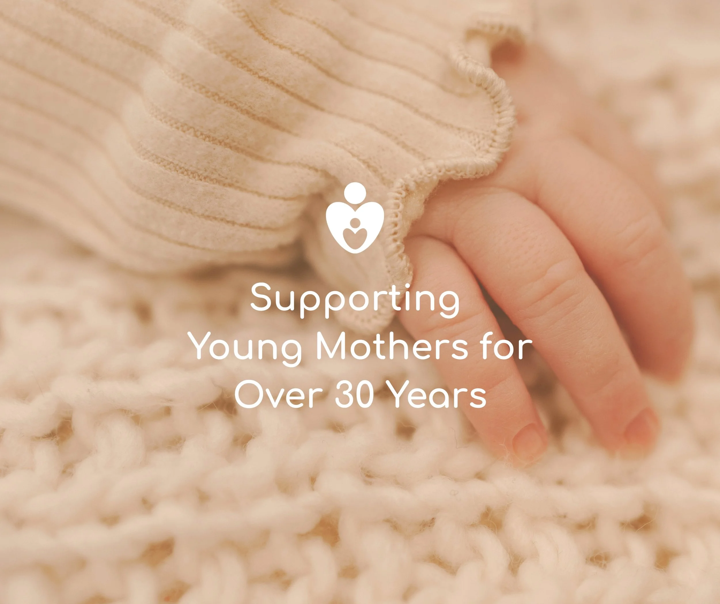
The rebrand focused on evolution rather than reinvention. The heart shape from the original logo—an element familiar to the organization and its supporters—was preserved as the foundation of the new mark.
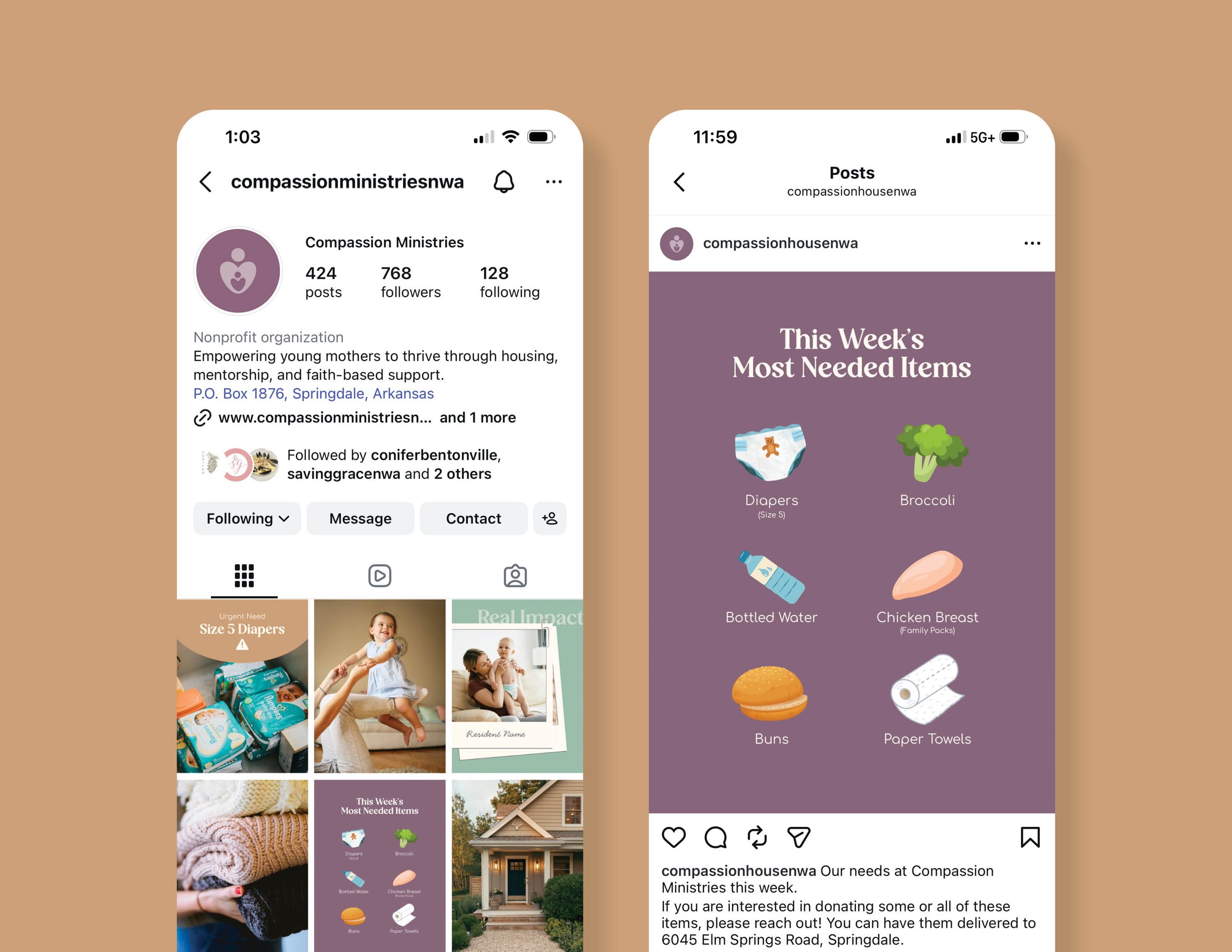
That familiar symbol was refined into a softer, more confident logomark designed to perform well across digital platforms, social media, and modern marketing materials. The updated design introduced a pastel color palette that felt warm, hopeful, and contemporary, reinforcing the organization’s nurturing environment.
Round, inviting typography complemented the new visual direction, helping the brand feel more human and accessible while maintaining clarity and professionalism. Together, these elements created a cohesive identity system that could extend naturally across print, digital, and fundraising communications.
The Result
Two refined identity directions were presented to the client, both designed to modernize the brand while preserving its emotional core. The organization responded enthusiastically to both concepts and quickly selected the final direction after a brief review period.
The chosen brand gives Compassion House a fresh, welcoming identity that aligns with its mission and positions the organization to connect more effectively with modern audiences and future donors.